Monday, 23 July 2012

Inside The Engine Room

Hi

Seeing how much you all loved my step-by-step Owl intro (slight sarcasm there :)
Here’s a step by step of how I designed the Swordsman intro page...

Again another character who’s not in that many comics with good big images to choose from (that’s why we commissioned a fresh cover), so some jiggery-pockery was needed to produce a page 2 (in my mind the second most important image needed after the cover, third being the main image on page 10 Amazing Secrets).

So I came across an old black and white pic from issue 7 of FOOM magazine (by Dave Cockrum).


Did the best I could colouring it up using my basic skills.


Then I thought “what if he was ripping through the page?”
Found this image from Essential Avengers. Perfect.


 Although it took some cloning and redrawing to get a full ‘rip’ image.


Cobbled together some Swordsman related panels as the backdrop. (I also economically re-used this throughout magazine as backgrounds).

  Took the word balloon from Swordy’s first appearance Avengers 19 (I also used the Kirby drawn figure on page 10-11).


Designed a simple logo.
 Fit all the pieces together (bust him over the text for full effect!) and you have an effective page 2 for your magazine.
 

Or you could let the professionals have a go...
 

COVERS UNCOVERED

Final Shaman cover art courtesy of Andie Tong


Final design WBN


Final design Vance Astro


Trapster Final design


Made the logo from this recent Deadpool cover. I think you'll agree it's gooey stuff.


SPECIALS UPDATE:

Thanks for the forum poll and all your comments on who should be the final special.

Again I must re-iterate, EM management will make the final decision.

We haven’t come to decision yet, but we are narrowing the field down, I will reveal the final player in the game as soon as I know for sure.


FINAL THOUGHTS:
 

Hey Stan’s a collector too!...
http://www.corbisimages.com/stock-photo/rights-managed/42-20381457/stan-lee#.UAWXXeIyqnY.facebook

Thursday, 5 July 2012

SPECIAL NEWS!

Yippee! We have been given another special!

I have come up with a shortlist for the management to choose from.

They will be looking a price points (sizes) and overall saleability of the particular character, so we wait with anticipation their choice(s).

The 6 options we gave were:

Lockjaw
Strong Guy
Archangel
Skurge
Destroyer
Groot & Rocket Raccoon (not a double pack - RR would be on his shoulder or something)

I looked at the forum polls as well as blog votes, also overall deserve-abiltiy and visual power.
I did want to maybe give the option of Red Hulk or Planet Hulk, but there seemed very little fan interest in those (although I would imagine they may sell well to the wider audience?)

I think this a good mix from which to choose from - EM management decision will be final (with a hopefully a little input from Rich and myself - I have my personal favs, but I'm glad it's not my final decision).

Thanks for all those still with us - there's life in the old dog yet.


'Variant' Covers

Every month Diamond Previews requests the latest covers for their catalogue, they work a good few months ahead of me, so as such I haven't always got a cover image ready to send them. So I do a mock-up cover featuring whatever artwork I can quickly get my hands on to create a realistic visual representation of the character. Here are some recent 'variants' that will only be used in Previews...

We had planned to commission new art for J.J.J., but hadn't got around to it by the time Previews wanted a cover, so I found this rather animated shot on google (later discovered it was from the Ultimate Spider-Man universe), Editor John Tomlinson kindly donated his signiture for the logo (which I later dumped for a font based logo).


Another one we were still to commission, eventually became the page 2 image. Actually makes a very fine cover...


Used the '80s handbook image for this one, with the cover to Avengers #19 for a background. Not bad but, not up to standards as a final cover. (note the 'the' was dropped on final logo). This pic of Swordy was eventually used on page 3.


Andie Tong will eventually do a fresh cover for Shaman, but for Previews I went with his figure sketch with a tundra background cribbed from Snowbird's issue. Again actually quite nice - but I'm sure Andie's new cover will be more dynamic and much bettererererer.


Hey, here it is...


We got Steven Butler to do the Terrax wraparound, but I threw together this cover in it's absence.


The final art wasn't ready for Tiger Shark so I did a quick colouring up of John Royle's sketch.
(NB. I didn't like my initial logo so went for some original comic book lettering on the final cover).


Hope your enjoyed this little trip through the inner workings of the CMFC.


 Th-th-th-the that's all f-f-folks!

Friday, 22 June 2012

Bonus Art Blog

I said I wouldn't be back for 2 weeks but I couldn't resist!

I'm just going to upload things that I think may interest you as they arise.

As I've just finished The Owl's very own magazine, I thought I'd share something of the processes of putting the mag together. You may think all the images come from a big Marvel database (they do have an image library but it's nowhere near good enough for our purposes - I think it has 3 or 4 dodgy pics of the Owl).

We did order the Cover image directly from Marvel, but this takes forward planning so I mainly just reserve that service for cover images that I know I'll need. The ordering process can take up to 2-3 weeks.

So we do a bit of research and compile a list of all the characters appearances (and buy as many as we can) - I think The Owl had about 70 appearance (not all useable!)

So you can imagine it was difficult to find a large full page image of the meanie for the intro page! I found this Pin-up by Gene Colan from Daredevil Annual 1 (DD Masterwork Vol.3).

As lovely as it is, it had text on it and very garish bright colours - so I thought why not re-colour it and give it a moodier feel.

Firstly I scanned the page at 800dpi and isolated the black line art (fairly easy to do using channels in Photoshop) creating a layer of just black. Then I went about removing the bits I didn't want (the lettering and captions) and carefully filling in the tree where I'd removed the box, plus extending the tree on the left (to allow for the shape of our magazine and the text area that goes over the artwork).

Then creating layers underneath the black line art I started to add colour and textures. I created the background by overlaying two google images of night sky together and playing about with the colour (settled for the moody purple). I found actual photos of an owl and tree bark and merged those in aswell. I also gave old Leyland Owlsley a bit of texture to his cape and shoes.
 

Looks kinda ugly until the black line art is overlayed, and pulls it all together (and looks amazing IMO!)


Finally add the design and text elements (the logo was simple enough to create using an existing font). Et voila! the IFC (inside front cover) or intro page as I call it, is ready...


This page maybe took me 1-2 hours to achieve. Purists may balk at this modernising of vintage comics, but the original line work is still there to be seen and changes had to be made to make it fit our format. So why not update if you are respectful of the original? 

'Nuff said.


PS someone asked about the numbers on the base stickers. They are purely made up to look like some sort of official numbering system, but they are randomly generated and have no baring on when or where they were made (Don't ask me why they do it!)

PPS A purely hypothetical question - But if we were to get another special before we wave adios, who should it be? Lockjaw, Destroyer, Skurge, Red Hulk, Onslaught? Who would really deserve the final spot in the collection?

PPPS You've done a great job getting the membership numbers up (189?), but I'd really love to get in to 200 members, so if anyone hasn't joined yet please do.

Bye for now. Dan


Wednesday, 13 June 2012

Great news kids!

 (That's a reference to the old weekly comics when they had less than great news to reveal.)

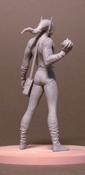
As you all know there will be much less work in progress to present to you guys on a weekly basis as we head towards to the final months of creative work on the collection (My schedule says January 9th will pretty much be my last day on the magazine). The figurines should really be all wrapped up by now (we are still waiting for Hela).

Although obviously it will continue to be published way into next year (I believe mid-April is the last publication date, but they may bring that forward to speed things up!)

So with this impending knowledge, there will of course be much less to blog about. I know you all still have much to say about the collection and Marvel Comics as a whole so I don't want to stop the blog just yet, I still enjoy reading your comments and theories (and rants!). So I think a fortnightly blog update will become the norm from now on - even if it's just to refresh the comments section.

As much as you would like me to answer certain questions pertaining to other possible EM collections and marketing/business decisions, I will unfortunately not be answering such questions as I'm not really the person to ask and as such just end up stirring things up or getting it wrong.

So the updates will be mainly images culled from the magazine and what few figurine stages we have left. Contrary to popular belief there are almost no development/vault/archive type images left to show you (that I know of anyway, the sculptors may have their own photo ref not presented to us?)

Anyway here are some of the remaining archive shots I have...


Come 'ave a go if ya think yer 'ard enuff!

A very early Thor that was rejected.


Some pose sketches for Gobbo.


Original un-altered master of Green Goblin.


Wolverine and Doc Ock master turnarounds.

That's all for now. Dan


Friday, 1 June 2012

Vance Astro Cover

This week I'm handing over the blog to Mr. Will Sliney, take it away fella...


Hey guys, Will Sliney here. I just want to take you through my process of creating the Vance Astro Cover for issue 190 of the Classic Marvel Figurine Collection.  

The brief.
As far as covers go, this was quite a standard brief. The point of it was to convey Vance in a heroic pose, bringing in some of the cosmic elements that accompany the Guardians of the Galaxy. I was supplied with plenty of reference, and I picked up a copy of Guardians of the Galaxy just to familiarize myself even more with the character. The first step in any illustration piece, whether it's a comic book pg, a cover or anything, is to thumbnail it out. A thumbnail is basically a quick image drawn to put your ideas down onto paper. It's essentially a visual brainstorming session. For Vance I came up with over 20 thumbnails, as I wanted to make sure I got the right pose. I wanted to supply the guys at CMFG and Marvel with plenty of options too. The more thumbnails you draw, the greater the likelihood you have of creating a decent image.


In the end, these were the 8 thumbnails I chose to send. My personal favourites were 1 and 3. Luckily for me, they chose to go with no. 3 With the layout chosen, its time to build up the figure. I work digitally in layers, but this is essentially the same as building up layers of pencil. I tend to work from very basic up. Adding in the Gesture first.

Followed by the musculature. Essentially, by now, all the hard work is done.


Over this I lay down the inks. After figuring out the lighting and shadows, all of the hard decisions have been made, now I can concentrate on the line weights and quality, giving the figure that polished finished.

Looking at the shield, I spent quite a while adding in tons of reflection lines. That's just a rendering technique that I enjoy doing myself.


To give it that cosmic feel I added in the classic Kirby Krackle that was made so famous back in the sixties by Jack Kirby himself.


When considering colour, I chose to invert the background and use the Kirby Kracle as a negative space window, through which I could add some nice space themed colours.


Now, onto colouring. First things first, I flat the image. This just separates out the individual areas for quick colouring. I find this the most tedious part of the colour process.


Add in the shading, and lighting in the figure. Make sure you pay attention to the lighting that was created in the inking stage of the figure.


After the lighting is done I usually apply a mood filter depending on the environment that the character is in. This is done by creating a separate layer of strong colour and adjusting its opacity. Basically it's like placing a light see through colour filament over the piece. Finally, add the background colours and give the shield some nice shiny effects.


Then one final change, (a good suggestion from my editor) to play down some of the line work in the white areas of the suit as well as some background tweaks.


And we are done! Hope you guys liked the step by step process. You can see more of my work over at my blog at sliney.blogspot.com. My email is there if you have any questions.

Thanks Will. Lovely experience working with you - and here's the preliminary final cover design.


Excelsior. Dan